This one is different. Every other experiment I’ve written about here was a thing I built and then described. How meta: the thing I’m describing is the place I’m writing it.
Ant.cat is the experiment. And the experiment was: take 10yrs of things I wanted to do and just do them. The goal was to stop treating your personal site as a monument and start treating it as a workbench.
Some background
I’ve had a personal site since roughly 2006. For most of that time it was a blog — a WordPress thing that I’d migrate every few years to a new stack, a new aesthetic, a new version of what I thought I wanted to put into the world. The posts from those years are still here: concert reviews, cartoons, dispatches from my twenties, letters to my daughter. A whole record of a person figuring things out.
The current version of the site is built in Astro. It has a homepage with a Three.js shader background and some hand-drawn character art I designed myself. It has a /writing section with those old posts. A /now page that includes Sam and Lu enjoying life. An /experiments section for things like this.
It’s a personal site the way I always wanted one to feel: a little weird, a little designed, not over the top but something to be proud of myself for.
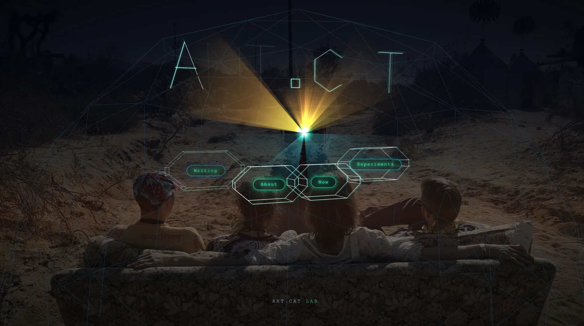 The homepage — Three.js shader background, hand-drawn characters, TUNE IN
The experiment
All collaboration was with Claude to get things cleaned up, migrated, and wired up. The whole process happened in a few phases over 2 weeks. In the past, it would take months to get something put together on WordPress. Now I’m working out of md files and the terminal and having way more fun.
It started with the things that bugged the heck out of me.
Quick recap:
- Get Ant.Cat setup with Github, CloudFare, properly hosted, and setup pipelines
- Migrate all Wordpress posts, including images
- Design a whole new experience to better explain experiments
- Add interactions through the site with animations and mouse movement
- I used ChatGPT for illustration conversion and frames and quick sizings
- Then there were tweaks here and there that Claude really wanted to explain…so I don’t have the heart to delete the rest of this write-up.
- The homepage was slow. Actually slow — close to 10MB of images on first load.
- The /now page characters (Sam and the astronaut) appeared with a noticeable delay after the background loaded, like they were late to their own party.
- The footer had my email address in plain text. It had been there for years.
- The nav button said “Mind Grapes” when it should have just said “Writing.”
None of these were emergencies. They were the kind of thing you notice every time and mean to fix.
What actually happened
The image problem. The hero images were PNG files — each one between 2.9MB and 3.5MB. We converted them to WebP: 84–87% smaller, visually identical. Then we went further: the two “zoom” images that appear when you click TUNE IN weren’t loading until they were needed. Now they don’t load at all until you interact. The Three.js texture also moved to WebP. Combined, the page went from nearly 10MB of images to well under 1MB on first load.
The timing problem. The /now page has a canvas animation that draws Sam and the astronaut frame by frame as you scroll. The original code loaded all the pose images simultaneously, which meant the canvas stayed blank until everything was ready. We restructured it so the seated pose — the first frame — loads with high priority and triggers a drawCanvas() call immediately on load. You see the characters right away. The rest of the poses load in behind them.
The footer. Replaced a raw email address with a LinkedIn icon link. One line of SVG, a few lines of CSS. The kind of thing that should take five minutes and somehow never gets done.
The nav label. “Mind Grapes” was a 30 Rock reference I’d been clinging to for years. Charming in 2013. Now it just confused people. It says “Writing” now.
The part I didn’t expect
Before touching any code, Claude read the blog. Not to summarize it — to understand how I write. Old posts from 2017. Letters to my daughter from 2023. The kind of writing that has nothing to do with performance optimization and everything to do with who I am.
That context made the collaboration different. When we worked on the experiments writeups for Baby is a Go and the Budget tool, the drafts sounded like me because they were built from an actual reading of my voice, not a generic “personal blog post” template.
I don’t know exactly how to describe the feeling of watching an AI navigate your 15-year archive of personal writing, match the register, and then tune the pixel timing on your character animation. But it was something.
Ok, now what?
A personal website is a strange object. It’s public but private. Finished but always provisional. You make it to say something about yourself at the moment you make it, and then you live past that moment and it keeps saying the thing anyway.
What changed here is that I stopped waiting to feel ready to improve it. I had a list of small things that bothered me. I’m genuinely proud of the full experience here and can’t wait to keep trying new things.
The key learning from every experiment I’ve posted here is the same, restated in a new context: the thing that makes something better is almost never the idea. It’s the decision to actually do it.
This site has been my personal internet home for almost 20 years. Turns out it still needed some work. And that’s fine…even great!
This is part of my experiments series — small things I build, ship, and write about.
E.VAX - “Just Like Fire (Full Album)”
Release notes
Ant.cat keeps changing. Every major release gets a note here, newest first.
v1.4 · October 20, 2026 · An eye on the TV
- The eye from the desert. After Tune In, the glow at the TV is now a hologram of the spiral eye sculpture from the photo. Its flame rays flicker like real sun rays, it blinks every few seconds, and its iris follows your mouse.
- Out of the TV. Tune In no longer just fades the scene in. The eye opens first, then the light cones, the wireframe dome, each section word along its own trail, and finally the ANT.CAT title all grow out of the screen in about a second and a half.
- Better on phones. On the Writing page, all four characters on the couch now appear at once, and the blue shirt waits a beat before he flies off, slow enough that you actually see him go.
v1.3 · October 17, 2026 · A nav that stays with you
- Sticky nav bar. I’d send people to the site, say “now go to the Now page,” and they’d already be halfway down a post with the nav long gone. Now, once you scroll past the top of any page, a slim bar slides in with Experiments, Writing, Now and About, and the page you’re on is lit.
- Links in the footer. The same four links wait at the bottom of every page, for whoever reads all the way down.
v1.2 · October 17, 2026 · A new homepage
- The TV lights up. After Tune In, the screen throws a cone of light toward you, over a wireframe desert that slowly shifts like dunes and under a turning geodesic canopy.
- Words with depth. Writing, Experiments, About and Now are each built from 20 layers of their own letters, trailing back into the TV screen. Move your mouse and the whole scene tilts with you. Hover a word and its layers fan out and glow mint.
- Click into the TV. Pick a section and a ring of static opens from the screen, the illustrated version of the scene shows through, and you zoom right into the TV on your way to the page.
- Any screen size. The words keep the same X around the TV from a wide monitor down to a phone, sized so nothing gets cut off.
v1.1 · October 11, 2026 · Quotes on About
- A few words to live by. The About page now opens with a Coach Wooden quote and a few others I keep coming back to.
v1.0 · October 6, 2026 · The site as the experiment
- Everything in the write-up above: GitHub, Cloudflare and a real deploy pipeline, every old WordPress post migrated, a new experiments section, a homepage that went from almost 10MB of images to under 1MB, characters on /now that show up on time, a LinkedIn link instead of my email in the footer, and “Writing” instead of “Mind Grapes.”